Apple’s monster results
With Apple culminating a blockbuster financial quarter, leaving most pundits and analysts dumbfounded, the questions boggling minds is that how a $400B company can sustain these “startup” levels of growth. In contrary to popular belief, this quarter is just one additional point of reference in what has been a consistent track record of exceeding expectations, as Asymco notes.
So what do Apple’s results indicate? A finer analysis of the details reveals some interesting tidbits:
Record selling prices for the iPhone:
With Average selling prices (remember—this is the “sell-in” price to carriers and distributors) topping $660 per iPhone, Apple’s numbers are quite phenomenal, considering that the $375 iPhone 3GS is still part of their product mix.
An additional fallout is that carriers now are plonking a majority of their subsidy budgets into Apple’s devices- does it seem like a co-incidence that Verizon’s dabbling with a $299 pricepoint for its Android flagships? Thats because the iPhone happens to be this huge abyss that sucks their subsidy pipe dry.
This effect is circular- the more customers demand the iPhone, the bigger the drain in a carriers subsidy budget. And hence more recent devices such as the Droid Razrs and Galaxy Nexus end up at progressively increasing price points beyond the psychological threshold of $199- and effectively putting them farther and farther outside the common consumer’s budget reach.
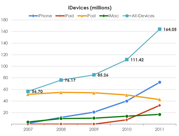
iDevice sales:
The graph speaks for itself. Enough said. What really stands out is how each subsequent product line has taken on the mantle of providing Apple with the next wave of growth. Simply simply phenomenal.

And finally- the internal metrics:
A careful analysis of the last few years has shown that the Apple has kept tremendous focus on keeping innovation structured and its processes efficient- no mean feat, considering that they have launched 2 blockbuster products over this time period and evolved their other 2 product lines significantly. Remember each of these metrics is completely controlled by Apple- but the graph below speaks for itself.

1. Gross margins: Tim Cook’s feats need no introduction. But a 25% *increase* in gross margins from 2006-2011 is beyond spectacular- remember this is one of the most explosive periods in this history of consumer technology where price points dipped ridiculously fast. Remember- this is also a time when some of Apple’s technology choices (3.5″multi- touch, Gorilla glass anyone?) hadn’t truly become mainstream enough for prices to start dropping.
2. Innovation is expensive: whether its on a product or a process level. With R&D expenses at just over 2.2% for 2011, Apple clearly is an industry leader. To give you some perspective, Microsoft and Google both averaged in the vicinity of 13% of revenues for 2011.
3. Sales, General and Administrative: From 2006 to 2011, Apple multiplied its workforce threefold, and it ended up spending less dollars per employee purely on an SG&A level. Remember this is a period where multiple stores were added sequentially, and the iPad and iPhone were launched. Another dimension to consider is the sales and marketing costs that are folded into this number- remember Apple’s famous mandate about no middlemen interference in the way the iPhone was marketed and sold? Granted, that Apple’s retail presence plays into this number, but lets take a minute here- by any stretch of imagination, this sort of performance is simply staggering.
About this entry
You’re currently reading “Apple’s monster results,” an entry on infilytics
- Published:
- January 29, 2012 / 9:38 pm
- Category:
- Apple
- Tags:

No comments yet
Jump to comment form | comment rss [?] | trackback uri [?]